
Thank you! Your submission has been received!
Oops! Something went wrong while submitting the form.
A guideline to tackle accessibility for your website.
.jpg)
Here’s a guideline to tackle accessibility for your website.
The first step towards improving accessibility is raising awareness about the topic. Talk with the team about it. Get comfortable around the topic. Maybe you can even make it fun!
The Fomo team once ate at a restaurant in Vietnam that served food by blind people in complete darkness. The experience was mind blowing. Maybe you can organize something similar with your team as an introduction to the topic.
You can also check out our 1-minute video for how a blind person navigates the web.
The majority of people with vision impairment are browsing your content because they have a clear intention (e.g. buy something). They are just trying to complete the task and therefore you should make this task as simple as possible. Any “Call to action” button (e.g. add to cart) should be available in the upper section of the page in order to be quickly accessible via TAB key.
Sometimes it is tempting to open a link in a new tab (window). For people with disabilities it is way harder to navigate back to the previous page if a link opens up in a new tab. Consider removing target="_blank" whenever possible.
If your website contains images, make sure that they are properly described with the alt HTML attribute. Make sure that all alt text is descriptive and purposeful!
If some content is not functional (e.g. if the purpose of the element is just for the visual experience) you can consider hiding it for a screen reader via aria-hidden=true attribute.
It is also possible to expose some content (e.g. important call to action buttons) to the users who are accessing your website through the screen reader. Popular CSS frameworks (like Twitter Bootstrap) have utilities to show some elements visible to screen readers only. It is as simple as adding a sr-only class to the relevant elements.
On non-root pages it is also helpful to a blind person if there are some shortcut links which lets users skip main navigation with a single click. Bootstrap uses sr-only-focusable property for this purpose. You can see such links on Amazon.com, however not yet on DuckDuckGo.com.
People with colour blindness could also experience problems with your website. You can consider adding options to enable high contrasts on your website (e.g link in navigation). If you are a developer who is building website themes you can make sure that this is not a hard thing to achieve! https://visionsvcb.org/ is a good example of a website which offers changing contrasts and font sizes of the page. It also has a “skip to main content” button which works great.
We would be happy to connect you to Timotej who also helped us! Timotej Skledar became blind due to a brain tumor 4 years ago, when he was only 24 years old. He was our intro to the world of accessibility - check out our initial interview.
You can reach out to him directly at skledar.timotej AT gmail.com. An hour of his time consulting could save you hours of your own research!


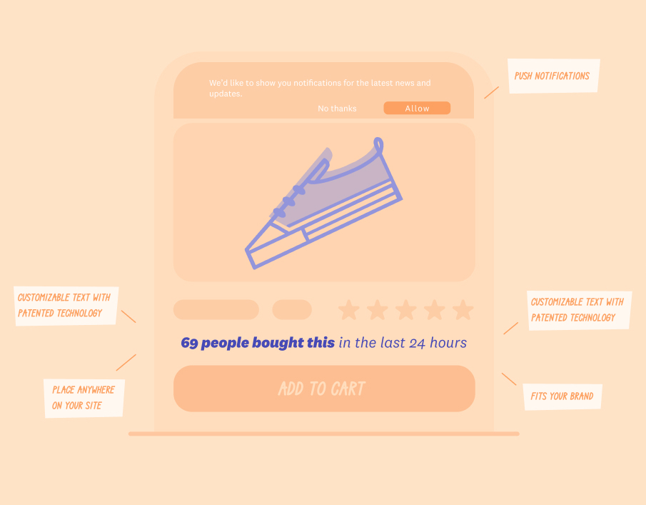
Keep reading, and you’ll learn several social proof strategies you can use to make your potential customers more likely to hit the “Buy” button.
 1.svg)
Don't settle for mediocrity! Experience the power of Fomo and witness a significant boost in trust and conversions on your website - just like 3500+ other businesses!
Try fomo for free now 1.svg)
Don't settle for mediocrity! Experience the power of Fomo and witness a significant boost in trust and conversions on your website - just like 3500+ other businesses!
Try fomo for free now
From SEO to design, to page speed, and content, ecommerce entrepreneurs depend on our guidance.
Don't settle for mediocrity! Experience the power of Fomo and witness a significant boost in trust and conversions on your website - just like 3500+ other businesses!
Try fomo for free now
Boost your sales and conversion with Social Proof
Try Fomo for free*No credit card required