Increase Sales With These 10 Types of Abandoned Cart Notifications

Learn why shoppers abandon the carts and how you can leverage 10 types of abandoned cart notifications to re-engage them.

As an e-commerce brand owner, seeing the rise in abandoned carts makes your heart sink. According to the Baymard Institute, the average abandoned cart rate is 70.19%.

If you find solace in shared misery, you're not alone. But what if you could actively reduce this number?

Enter abandoned cart push notifications, the unsung hero of e-commerce.

They are a second chance to re-engage your customers and bring them back into the sales funnel. And it’s not just about sending reminders—it’s about creating a compelling, tailored message that gives them a final nudge to seal the deal on your e-commerce site.

With an effective push notification strategy for abandoned cart recovery, you can potentially reclaim a significant portion of otherwise lost sales. Re-engaging with high purchase intent buyers can boost your bottom line.

In this blog, we’re going to deep dive and break down the different types of abandoned cart push notifications e-commerce marketers can use along with some actionable tips that can be handy while implementing them.

Why do shoppers abandon carts?

It’s disheartening to see customers take the time to browse and add items only to abandon them without completing the transaction. And you might be scratching your heads to understand—why?

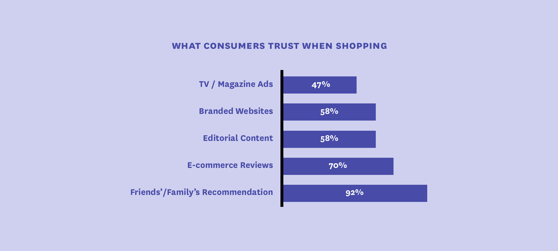
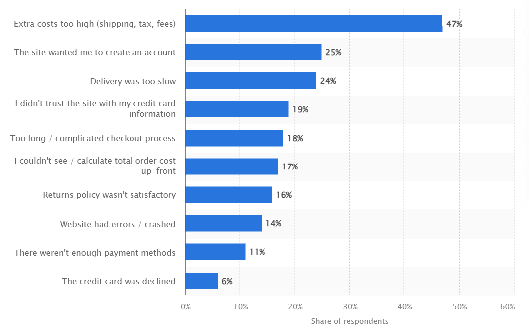
According to Statista, here are some of the most common causes of cart abandonment.
1. High shipping costs

Nothing is more off-putting than shoppers realizing they have to pay more than what they bargained for. This makes high shipping costs the most common cause of cart abandonment.

Avoid this by being transparent about all the costs upfront. Including shipping costs and convenience fees. The two ways to do this are:

  • Mention the shipping costs on the product page
  • Mention the shipping costs after the shopper enters their Zip code in the checkout form.

If they still add items to the cart, chances are they will proceed in completing the transaction.

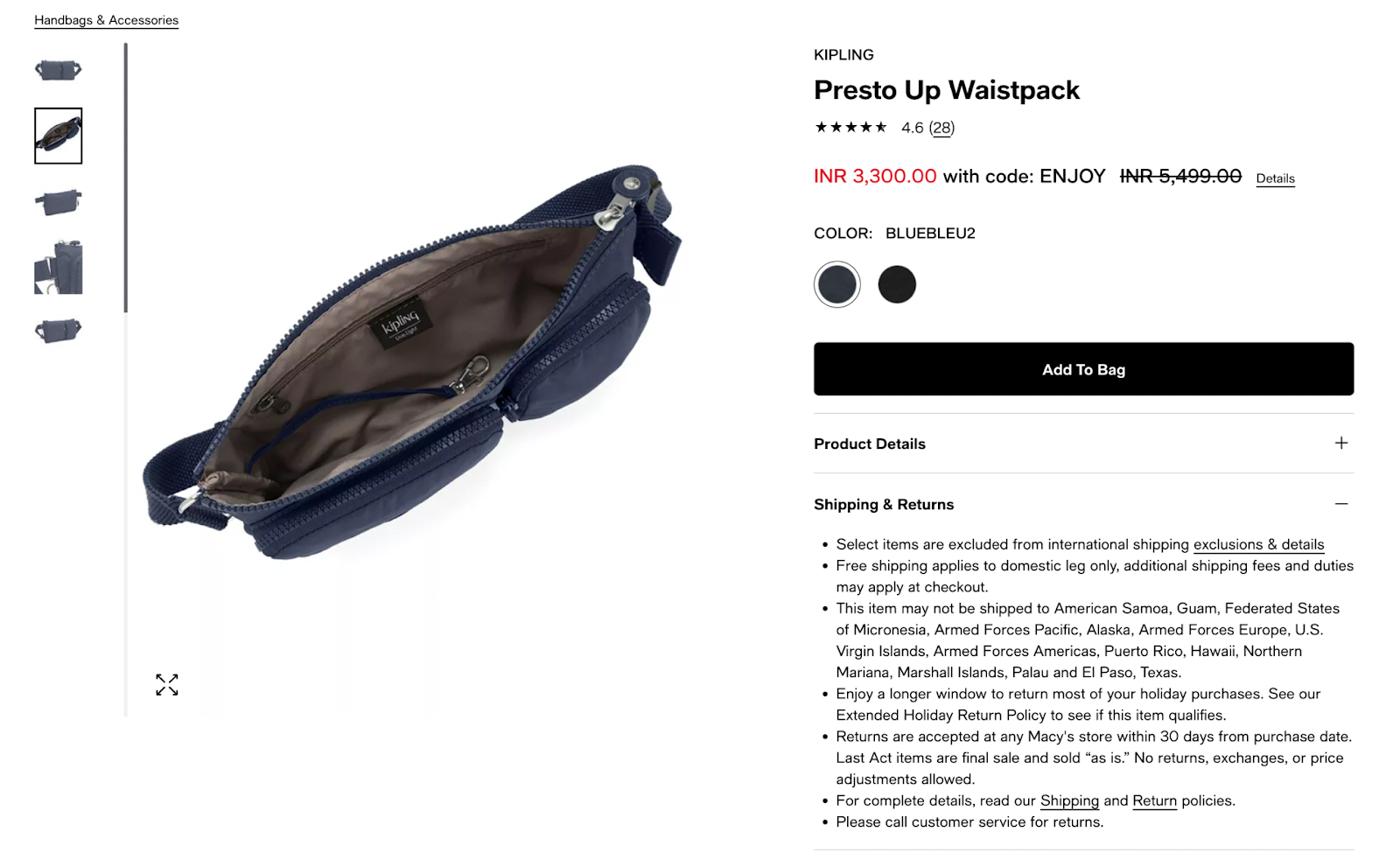
The fashion retailer Macy’s displays shipping and returns information on each product page which saves the shopper the additional step of checking out the shipping and returns policies.
2. Complex checkout process

A long, complex checkout process is another leading cause of cart abandonment. Every added step in the process or form field makes it harder to complete payments.

For a simple checkout process:

  • Set up auto-fill forms at the checkout stage
  • An auto-save feature for repeat customers and potential buyers who abandon their cart and return later to complete the transaction.

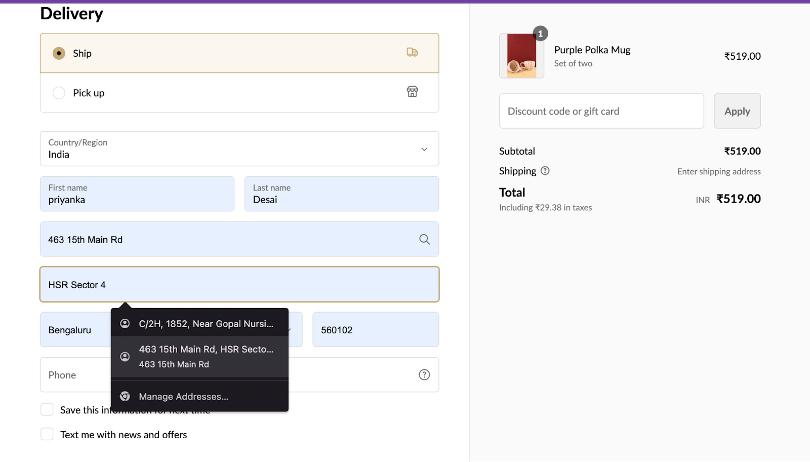
E-commerce lifestyle brand Weaving Homes streamlines the checkout process with the address auto-fill feature. The goal at this stage is to reduce the amount of time and effort required to make the purchase and if the buyer already has the information saved on the desktop/mobile, let them use it.
3. Forced account creation

Forcing them to create an account breaks the purchase cycle for them, hampering the overall user experience.

Offer a guest checkout process. Collect emails and other contact information when they’re filling out their delivery address. This may add another field, but it won’t break the purchase flow, and the customer won’t feel obligated to create an account.

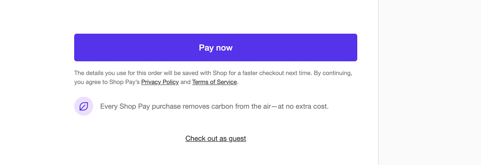
Simply Hike, an e-commerce store for hiking, camping, and walking products offers shoppers the option of guest checkout on the checkout page: where they can choose from ShopPay, PayPal, and Google Pay for express checkout.
4. Lack of payment options

Customers shopping online want a seamless experience. This includes paying for their items at the time of checkout. Not having their preferred payment option can make or break the sale, forcing them to check out the competitors.

Consider adding digital wallets, mobile payments, COD, and Buy Now, Pay Later options alongside the usual credit and debit cards.

Optimize the payment options based on your target audience.

If your brand targets the Gen-Z audience, include Buy Now, Pay Later as a payment option as Gen-Z relies more on BNPL for small everyday purchases. Offer a one-click checkout for added convenience.

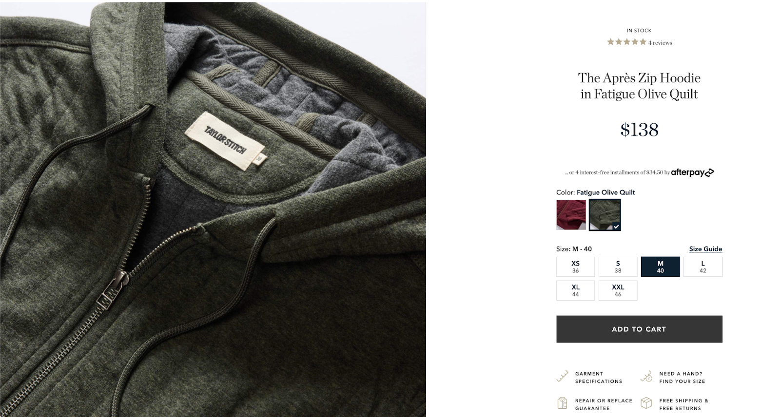
Taylor Stitch, the UK-based men’s clothing brand gives users the option to pay 4-interest-free installments of $34.50 using afterpay. At the checkout there are ShopPay, PayPal, and Google Pay options for express checkout.
5. Website issues

Often an understated problem, but issues like product image and product page loading slowly and dead clicks can possibly have a negative shopping experience, leading to cart abandonment. This would disrupt the shopping experience, prompting customers to seek out other options.

Continuously test and analyze the performance of your pages. Keep your website and shopping cart mobile-friendly for mobile shoppers.

How to use abandoned cart notifications effectively?

  1. Timing is key- When a user abandons their cart, you’ve only got a few hours to re-engage them otherwise, they might even forget browsing your e-commerce store in the past.
    Give them at least 30 minutes after they abandon the cart to return and complete the purchase.
    And if they don’t, send them an abandoned cart notification as a web push notification.
  2. Personalization- Customers expect personalization at every step of the journey, including in the abandoned cart notifications.
    Using their first name, similar product tastes, and purchase history, build connections and bring them back to complete the purchase.
    Moreover, based on their browsing history, send them a personalized abandoned cart email and additional product recommendations to upsell and cross-sell.
  3. Clear Call-to-Action (CTA) - Use power words like “Complete Purchase,” “Proceed to Payment,” or “Continue Shopping” to get users to do exactly what you want. Also, make sure your CTAs are prominent and easy to click.
  4. Offer incentives- A flash sale for subscribers, a free add-on, limited-time deals on the cart items, or BOGO (buy 1 get 1) are great ways to nudge your customers to complete the purchase.
    Combining the low-selling products with the high-selling ones at a discounted price is a great way to remove your deadstock.

10 Types of abandoned cart notifications worth implementing

1. Promotional notification

Let’s take the example of the promotional push notification from Fable Street, an e-commerce premium workwear brand for women, aimed at retargeting its audience.

What we liked

  1. Engaging question: The notification starts with "What's on your mind?" which is a compelling prompt that can grab the user's attention immediately.
  2. Clear branding: The website URL "www.fablestreet.com" is prominently displayed, ensuring brand recognition.
  3. Value proposition: The notification teases "our new collection," which instills curiosity in the reader to check out what's new.

Pro tip: Create curiosity in your abandoned cart push notification to increase the open rates.

2. Incentive-driven notification

Blissclub, an activewear brand for women, offers an excellent example of an incentive-driven push notification to improve conversion rates.

What we liked

  1. Urgency: The cart icon, the number of items in the cart, and the discounted price in bigger font draw the shopper’s attention instantly.
  2. Clear incentives: Multiple offers (Blisscoins and the discount) motivate the user to take action.
  3. Visually engaging: Vibrant colors and a clear layout make the information easily digestible and appealing.
  4. Strong call-to-action: Both the promo code and the "Order Now" button give clear instructions on the next steps the user should take.

Pro tip: Add a clear incentive in your web and mobile app push notification to increase conversions.

3. Back-in-stock notification

82E, a self-care brand, expertly executes the back-in-stock push notification shown below as a follow-up strategy.

What we liked

  1. Clarity: The notification gets straight to the point, announcing that a product is back in stock.
  2. Detailed description: The notification not only announces the restock but also reminds users of the product's benefits.

Pro tip: Add a product description to the abandoned cart push notification as the busy subscriber would have likely forgotten product benefits.

4. Urgency-driven notification

82E's push notification, which focuses on abandoned cart reminders, stands out not just for its clarity but for the real limited-time urgency it imparts to its audience.

What we liked

  1. Urgency in the header: The phrase "There's Hardly Any Time..." is effectively attention-grabbing and sets an immediate tone of urgency and prompts the buyer to act fast.
  2. Clear offer: The offer "Enter code CHERISH30 to avail 30% OFF" is direct and to the point. Users appreciate clarity, leaving no room for ambiguity about what's being offered.
  3. Time-bound CTA: The statement "just one more day" creates a sense of scarcity and further emphasizes urgency, encouraging users to avail the offer without delay.

Pro tip: Optimize your subject line for on-the-go buyers.

5. Price drop notification

Uniqlo, the casual wear brand, demonstrates the effectiveness of a price drop push notification for abandoned cart recovery.

What we liked

  1. Branding: The "UNIQLO" logo is prominent and instantly recognizable, building trust with the recipient.
  2. Attention-grabbing header: "Price Dropped" captures attention and sparks curiosity.
  3. Highlighted product benefits: Describing the sweaters as "extra-soft" and "machine-washable" emphasizes convenience and comfort.

Pro tip: Optimize the copy of your push notifications to target customers who’ve made a wishlist but are yet to purchase the product.

6. Social proof notification

SingleSwag’s live pop-up pairs social proof with exclusivity, boosting trust and highlighting the brand’s unique self-care appeal.

What we liked

  1. Real-time updates: By indicating that the purchase happened "about 2 hours ago," the notification offers a sense of immediacy, real-time engagement, and the impression that the product is in demand and popular among shoppers.
  2. Localization: By mentioning "Paula in Brooklyn Park," the brand uses localization to connect with potential buyers, especially those from or familiar with Brooklyn Park. Experiment to see if localization reduces the shopping cart abandonment rate as it adds more relevance to the shopping experience.
  3. Clear product description: The product, "SingleSwag," is clearly and descriptively named and can entice potential customers interested in the features of SingleSwag.
  4. Social proof: The fact that someone purchased SingleSwag acts as social proof and indicates it’s a trustworthy online brand.

Pro tip: Social proof marketing platform Fomo allows you to send geolocation pop-ups by prioritizing content from the shopper’s area.

Check out how SingleSwag’s sales surged by $100k using social proof notifications.

7. Push notification for users who have not signed up

Uniqlo masterfully demonstrates the essence of a non-signed-up web push notification for customers who have added items to the cart but have not signed up.

What we liked

  1. Brand logo: The bright red UNIQLO logo is immediately recognizable, giving users a clear indication of which brand the notification originates from. A strong visual identity can reinforce brand recall and trust.
  2. Urgency: The phrase "Don't miss out!" creates a sense of urgency, encouraging the user to take immediate action. This can be an effective technique to prompt users to open the app or complete the sign-up process.
  3. Clear offer: By providing a tangible incentive (Rs 300 coupon), the brand increases the likelihood of the user taking the desired action.
  4. Contextual reminder: "Forgot signing up?" is a contextual message reminding users that they might have missed completing an action.

Pro tip: Add the user’s name to the abandoned cart recovery notification to personalize the messaging.  

8. Bundled push notification

A bundle offer push notification alerts customers about special discounts when purchasing a group of products together. Works best for repeat customers and those with items lying in their cart.

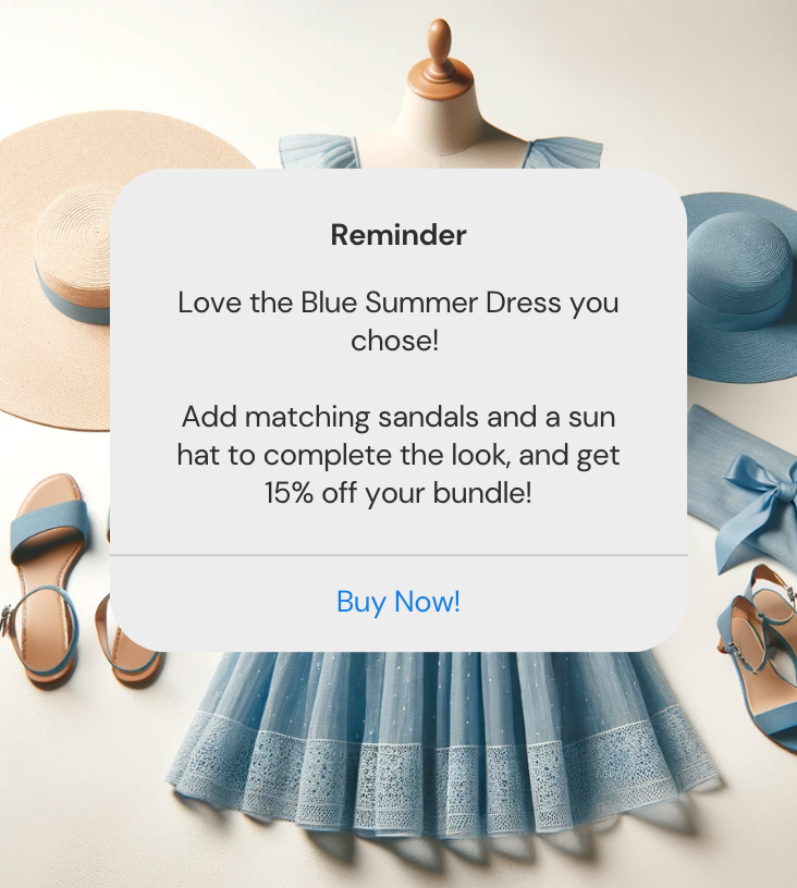
The ethical clothing brand Boden sends a push notification nudging the buyer to add matching sandals and a hat with the summer dress to avail 15% discount.
What we liked

  1. Clear and concise message: Within a few words, the customer knows the product in question, the offer, and the potential savings.
  2. Personalization: Using phrases like "Love the Blue Summer Dress you chose!" creates a personalized touch and also serves as a reminder that the customer had either purchased it earlier, or it’s lying in the cart.
  3. Instant value proposition: The discount offer of "15% off your bundle" is a compelling incentive for users to consider adding the suggested items to their cart.
  4. Prominent CTA: The "Buy Now!" button is prominent, urging users to take immediate action. Its position and clarity make it easy for users to proceed with the purchase.

Pro tip: Keep updating product suggestions based on seasons, trends, festivals, and discounts.

9. Creative push notification

You can learn a few things about how to write creative push notifications from Sugar Cosmetics.

What we liked

  1. Playful and engaging tone: The use of "Seein' you tonight" (an Instagram trend) and the emoji adds a fun and casual tone to the message, which can resonate with a younger or more relaxed audience.
  2. Clever wordplay: "It's (not) a bad idea, right?" provides an unexpected twist, drawing attention and prompting curiosity. It implies that the deal is too good to miss out on.
  3. Visually appealing elements: The use of the emoji and the sparkle emoji ("✨") adds visual appeal to the text, breaking the monotony and making the notification more noticeable.
  4. Conversational approach: The overall tone feels like a conversation, making it more relatable and less like a traditional ad, which could lead to better engagement rates.

Pro tip: Show your brand's personality in your abandoned cart push notification copy.

10. Urgency-driven push notification

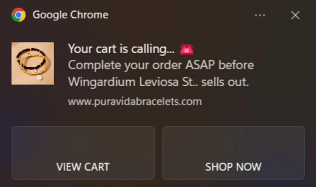
Pura Vida Bracelets’ push notifications are creative and use urgency driven copy to remind customers of products awaiting in their abandoned cart.
What we liked

  1. Grabs attention immediately: It starts with a catchy phrase, "Your cart is calling..."
  2. Emojis in the subject line: The phone emoji reinforces the 'calling' action, making the message visually interesting.
  3. Urgency: "Complete your order ASAP," encourages quick action to avoid missing out.
  4. Visual cues: There's a clear, attractive image of the product that reminds the user exactly what they are interested in, which can re-ignite the desire to purchase.
  5. Clear CTA: Two distinct CTAs, "VIEW CART" and "SHOP NOW," provide straightforward next steps for the user.
  6. Branding: It includes the website URL, which reinforces brand recognition and provides a direct pathway to the website.

Pro tip: Don’t refrain from using emojis in your push notifications.

Do you have an abandoned cart push notification strategy in place?

Every e-commerce site has abandoned carts, but they can be effectively managed. By employing a robust abandoned cart notification strategy, you can significantly boost conversions, open rates, and customer retention.

Remember, the key to preventing abandoned carts is not just identifying why users are leaving but actively guiding them back using smart, data-driven notifications. Let Fomo be your guiding tool to turn your almost-customers into brand advocates.

Book a free trial now.

Table Of Content

As an e-commerce brand owner, seeing the rise in abandoned carts makes your heart sink. According to the Baymard Institute, the average abandoned cart rate is 70.19%.

If you find solace in shared misery, you're not alone. But what if you could actively reduce this number?

Enter abandoned cart push notifications, the unsung hero of e-commerce.

They are a second chance to re-engage your customers and bring them back into the sales funnel. And it’s not just about sending reminders—it’s about creating a compelling, tailored message that gives them a final nudge to seal the deal on your e-commerce site.

With an effective push notification strategy for abandoned cart recovery, you can potentially reclaim a significant portion of otherwise lost sales. Re-engaging with high purchase intent buyers can boost your bottom line.

In this blog, we’re going to deep dive and break down the different types of abandoned cart push notifications e-commerce marketers can use along with some actionable tips that can be handy while implementing them.

Why do shoppers abandon carts?

It’s disheartening to see customers take the time to browse and add items only to abandon them without completing the transaction. And you might be scratching your heads to understand—why?

According to Statista, here are some of the most common causes of cart abandonment.

1. High shipping costs

Nothing is more off-putting than shoppers realizing they have to pay more than what they bargained for. This makes high shipping costs the most common cause of cart abandonment.

Avoid this by being transparent about all the costs upfront. Including shipping costs and convenience fees. The two ways to do this are:

  • Mention the shipping costs on the product page
  • Mention the shipping costs after the shopper enters their Zip code in the checkout form.

If they still add items to the cart, chances are they will proceed in completing the transaction.

The fashion retailer Macy’s displays shipping and returns information on each product page which saves the shopper the additional step of checking out the shipping and returns policies.

2. Complex checkout process

A long, complex checkout process is another leading cause of cart abandonment. Every added step in the process or form field makes it harder to complete payments.

For a simple checkout process:

  • Set up auto-fill forms at the checkout stage
  • An auto-save feature for repeat customers and potential buyers who abandon their cart and return later to complete the transaction.

E-commerce lifestyle brand Weaving Homes streamlines the checkout process with the address auto-fill feature. The goal at this stage is to reduce the amount of time and effort required to make the purchase and if the buyer already has the information saved on the desktop/mobile, let them use it.

3. Forced account creation

Forcing them to create an account breaks the purchase cycle for them, hampering the overall user experience.

Offer a guest checkout process. Collect emails and other contact information when they’re filling out their delivery address. This may add another field, but it won’t break the purchase flow, and the customer won’t feel obligated to create an account.

Simply Hike, an e-commerce store for hiking, camping, and walking products offers shoppers the option of guest checkout on the checkout page: where they can choose from ShopPay, PayPal, and Google Pay for express checkout.

4. Lack of payment options

Customers shopping online want a seamless experience. This includes paying for their items at the time of checkout. Not having their preferred payment option can make or break the sale, forcing them to check out the competitors.

Consider adding digital wallets, mobile payments, COD, and Buy Now, Pay Later options alongside the usual credit and debit cards.

Optimize the payment options based on your target audience.

If your brand targets the Gen-Z audience, include Buy Now, Pay Later as a payment option as Gen-Z relies more on BNPL for small everyday purchases. Offer a one-click checkout for added convenience.

Taylor Stitch, the UK-based men’s clothing brand gives users the option to pay 4-interest-free installments of $34.50 using afterpay. At the checkout there are ShopPay, PayPal, and Google Pay options for express checkout.

5. Website issues

Often an understated problem, but issues like product image and product page loading slowly and dead clicks can possibly have a negative shopping experience, leading to cart abandonment. This would disrupt the shopping experience, prompting customers to seek out other options.

Continuously test and analyze the performance of your pages. Keep your website and shopping cart mobile-friendly for mobile shoppers.

How to use abandoned cart notifications effectively?

  1. Timing is key- When a user abandons their cart, you’ve only got a few hours to re-engage them otherwise, they might even forget browsing your e-commerce store in the past.
    Give them at least 30 minutes after they abandon the cart to return and complete the purchase.
    And if they don’t, send them an abandoned cart notification as a web push notification.
  2. Personalization- Customers expect personalization at every step of the journey, including in the abandoned cart notifications.
    Using their first name, similar product tastes, and purchase history, build connections and bring them back to complete the purchase.
    Moreover, based on their browsing history, send them a personalized abandoned cart email and additional product recommendations to upsell and cross-sell.
  3. Clear Call-to-Action (CTA) - Use power words like “Complete Purchase,” “Proceed to Payment,” or “Continue Shopping” to get users to do exactly what you want. Also, make sure your CTAs are prominent and easy to click.
  4. Offer incentives- A flash sale for subscribers, a free add-on, limited-time deals on the cart items, or BOGO (buy 1 get 1) are great ways to nudge your customers to complete the purchase.
    Combining the low-selling products with the high-selling ones at a discounted price is a great way to remove your deadstock.

10 Types of abandoned cart notifications worth implementing

1. Promotional notification

Let’s take the example of the promotional push notification from Fable Street, an e-commerce premium workwear brand for women, aimed at retargeting its audience.

What we liked

  1. Engaging question: The notification starts with "What's on your mind?" which is a compelling prompt that can grab the user's attention immediately.
  2. Clear branding: The website URL "www.fablestreet.com" is prominently displayed, ensuring brand recognition.
  3. Value proposition: The notification teases "our new collection," which instills curiosity in the reader to check out what's new.

Pro tip: Create curiosity in your abandoned cart push notification to increase the open rates.

2. Incentive-driven notification

Blissclub, an activewear brand for women, offers an excellent example of an incentive-driven push notification to improve conversion rates.

What we liked

  1. Urgency: The cart icon, the number of items in the cart, and the discounted price in bigger font draw the shopper’s attention instantly.
  2. Clear incentives: Multiple offers (Blisscoins and the discount) motivate the user to take action.
  3. Visually engaging: Vibrant colors and a clear layout make the information easily digestible and appealing.
  4. Strong call-to-action: Both the promo code and the "Order Now" button give clear instructions on the next steps the user should take.

Pro tip: Add a clear incentive in your web and mobile app push notification to increase conversions.

3. Back-in-stock notification

82E, a self-care brand, expertly executes the back-in-stock push notification shown below as a follow-up strategy.

What we liked

  1. Clarity: The notification gets straight to the point, announcing that a product is back in stock.
  2. Detailed description: The notification not only announces the restock but also reminds users of the product's benefits.

Pro tip: Add a product description to the abandoned cart push notification as the busy subscriber would have likely forgotten product benefits.

4. Urgency-driven notification

82E's push notification, which focuses on abandoned cart reminders, stands out not just for its clarity but for the real limited-time urgency it imparts to its audience.

What we liked

  1. Urgency in the header: The phrase "There's Hardly Any Time..." is effectively attention-grabbing and sets an immediate tone of urgency and prompts the buyer to act fast.
  2. Clear offer: The offer "Enter code CHERISH30 to avail 30% OFF" is direct and to the point. Users appreciate clarity, leaving no room for ambiguity about what's being offered.
  3. Time-bound CTA: The statement "just one more day" creates a sense of scarcity and further emphasizes urgency, encouraging users to avail the offer without delay.

Pro tip: Optimize your subject line for on-the-go buyers.

5. Price drop notification

Uniqlo, the casual wear brand, demonstrates the effectiveness of a price drop push notification for abandoned cart recovery.

What we liked

  1. Branding: The "UNIQLO" logo is prominent and instantly recognizable, building trust with the recipient.
  2. Attention-grabbing header: "Price Dropped" captures attention and sparks curiosity.
  3. Highlighted product benefits: Describing the sweaters as "extra-soft" and "machine-washable" emphasizes convenience and comfort.

Pro tip: Optimize the copy of your push notifications to target customers who’ve made a wishlist but are yet to purchase the product.

6. Social proof notification

SingleSwag’s live pop-up pairs social proof with exclusivity, boosting trust and highlighting the brand’s unique self-care appeal.

What we liked

  1. Real-time updates: By indicating that the purchase happened "about 2 hours ago," the notification offers a sense of immediacy, real-time engagement, and the impression that the product is in demand and popular among shoppers.
  2. Localization: By mentioning "Paula in Brooklyn Park," the brand uses localization to connect with potential buyers, especially those from or familiar with Brooklyn Park. Experiment to see if localization reduces the shopping cart abandonment rate as it adds more relevance to the shopping experience.
  3. Clear product description: The product, "SingleSwag," is clearly and descriptively named and can entice potential customers interested in the features of SingleSwag.
  4. Social proof: The fact that someone purchased SingleSwag acts as social proof and indicates it’s a trustworthy online brand.

Pro tip: Social proof marketing platform Fomo allows you to send geolocation pop-ups by prioritizing content from the shopper’s area.

Check out how SingleSwag’s sales surged by $100k using social proof notifications.

7. Push notification for users who have not signed up

Uniqlo masterfully demonstrates the essence of a non-signed-up web push notification for customers who have added items to the cart but have not signed up.

What we liked

  1. Brand logo: The bright red UNIQLO logo is immediately recognizable, giving users a clear indication of which brand the notification originates from. A strong visual identity can reinforce brand recall and trust.
  2. Urgency: The phrase "Don't miss out!" creates a sense of urgency, encouraging the user to take immediate action. This can be an effective technique to prompt users to open the app or complete the sign-up process.
  3. Clear offer: By providing a tangible incentive (Rs 300 coupon), the brand increases the likelihood of the user taking the desired action.
  4. Contextual reminder: "Forgot signing up?" is a contextual message reminding users that they might have missed completing an action.

Pro tip: Add the user’s name to the abandoned cart recovery notification to personalize the messaging.  

8. Bundled push notification

A bundle offer push notification alerts customers about special discounts when purchasing a group of products together. Works best for repeat customers and those with items lying in their cart.

The ethical clothing brand Boden sends a push notification nudging the buyer to add matching sandals and a hat with the summer dress to avail 15% discount.

What we liked

  1. Clear and concise message: Within a few words, the customer knows the product in question, the offer, and the potential savings.
  2. Personalization: Using phrases like "Love the Blue Summer Dress you chose!" creates a personalized touch and also serves as a reminder that the customer had either purchased it earlier, or it’s lying in the cart.
  3. Instant value proposition: The discount offer of "15% off your bundle" is a compelling incentive for users to consider adding the suggested items to their cart.
  4. Prominent CTA: The "Buy Now!" button is prominent, urging users to take immediate action. Its position and clarity make it easy for users to proceed with the purchase.

Pro tip: Keep updating product suggestions based on seasons, trends, festivals, and discounts.

9. Creative push notification

You can learn a few things about how to write creative push notifications from Sugar Cosmetics.

What we liked

  1. Playful and engaging tone: The use of "Seein' you tonight" (an Instagram trend) and the emoji adds a fun and casual tone to the message, which can resonate with a younger or more relaxed audience.
  2. Clever wordplay: "It's (not) a bad idea, right?" provides an unexpected twist, drawing attention and prompting curiosity. It implies that the deal is too good to miss out on.
  3. Visually appealing elements: The use of the emoji and the sparkle emoji ("✨") adds visual appeal to the text, breaking the monotony and making the notification more noticeable.
  4. Conversational approach: The overall tone feels like a conversation, making it more relatable and less like a traditional ad, which could lead to better engagement rates.

Pro tip: Show your brand's personality in your abandoned cart push notification copy.

10. Urgency-driven push notification

Pura Vida Bracelets’ push notifications are creative and use urgency driven copy to remind customers of products awaiting in their abandoned cart.

What we liked

  1. Grabs attention immediately: It starts with a catchy phrase, "Your cart is calling..."
  2. Emojis in the subject line: The phone emoji reinforces the 'calling' action, making the message visually interesting.
  3. Urgency: "Complete your order ASAP," encourages quick action to avoid missing out.
  4. Visual cues: There's a clear, attractive image of the product that reminds the user exactly what they are interested in, which can re-ignite the desire to purchase.
  5. Clear CTA: Two distinct CTAs, "VIEW CART" and "SHOP NOW," provide straightforward next steps for the user.
  6. Branding: It includes the website URL, which reinforces brand recognition and provides a direct pathway to the website.

Pro tip: Don’t refrain from using emojis in your push notifications.

Do you have an abandoned cart push notification strategy in place?

Every e-commerce site has abandoned carts, but they can be effectively managed. By employing a robust abandoned cart notification strategy, you can significantly boost conversions, open rates, and customer retention.

Remember, the key to preventing abandoned carts is not just identifying why users are leaving but actively guiding them back using smart, data-driven notifications. Let Fomo be your guiding tool to turn your almost-customers into brand advocates.

Book a free trial now.

Email Icon - Techpool X Webflow Template
Subcribe to our weekly email newsletter
Thank you! Your submission has been received!
Oops! Something went wrong

Do you want to be the next success story?

Start a 14-day free trial
Choose more sales this Black Friday with Fomo
Get 33% off. Plus a 30 day Free Trial
This is your last chance
Start your free trial now !
#
Days
#
Hours
#
Minutes
#
Seconds
Send push notifications
Easy to install
Display social proof

Related posts

Browse all posts

How to Boost Your e-Commerce Sales with Social Proof

Keep reading, and you’ll learn several social proof strategies you can use to make your potential customers more likely to hit the “Buy” button.

April 3, 2023
9
 min read

Turn your website visitors into customers!

Don't settle for mediocrity! Experience the power of Fomo and witness a significant boost in trust and conversions on your website - just like 3500+ other businesses!

Try fomo for free now
No credit card required.

CTA

April 13, 2023
 min read

Turn your website visitors into customers!

Don't settle for mediocrity! Experience the power of Fomo and witness a significant boost in trust and conversions on your website - just like 3500+ other businesses!

Try fomo for free now
No credit card required.

Ecommerce Add-To-Cart Strategies You Should Know About

From SEO to design, to page speed, and content, ecommerce entrepreneurs depend on our guidance.

March 30, 2023
8
 min read

Turn your website visitors into customers!

Don't settle for mediocrity! Experience the power of Fomo and witness a significant boost in trust and conversions on your website - just like 3500+ other businesses!

Try fomo for free now
No credit card required.
Check out our BFCM Offer. Save up to $1996 🎉
2 offers available
Monthly Plan
16.67% discount.
Save up to
$998.
No annual commitment. Pick the plan that best suits your needs and save up to $998 on your monthly subscription for the entire year.
Claim This offer
Annual Plan
33% discount.
Save up to
$1996.
Save big with the annual offer. Get an extended 30-day trial and save up to $1996 on your annual subscription.
Claim This offer
This is some text inside of a div block.

Show,Don't Tell.

Boost your sales and conversion with Social Proof

Try Fomo for free

*No credit card required